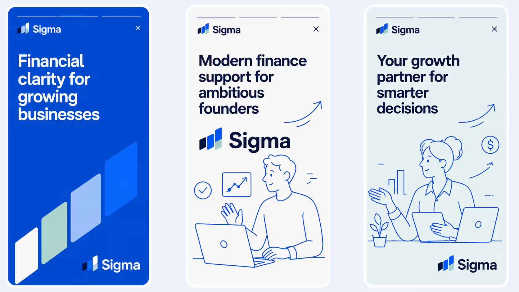
Sigma is a modern finance service built for growing businesses that need clearer numbers, sharper insights, and more confident decision-making. As an agency-led brand proposal, we approached Sigma with a new identity direction designed to move the brand away from traditional finance clichés and into a more confident, human, and scalable visual world.
The goal was to create a brand system that felt trustworthy without feeling cold, professional without feeling corporate, and ambitious without becoming overly complex. We wanted Sigma to feel like a finance partner for founders, operators, and growing teams — clear, supportive, and built around momentum.
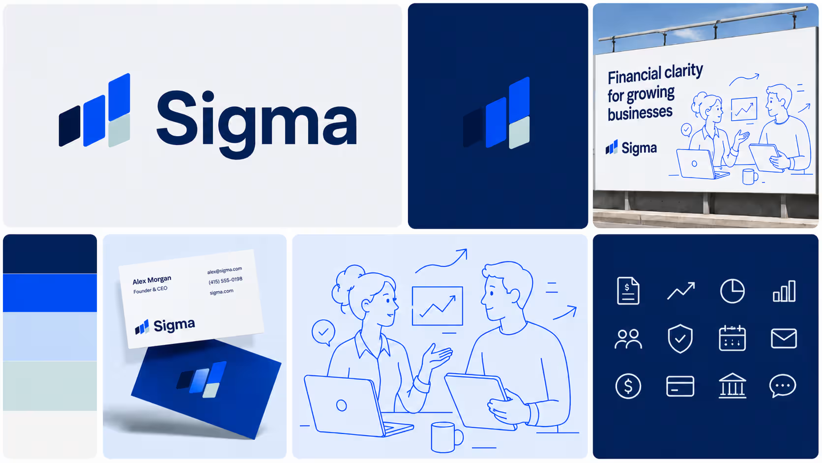
Finance brands often rely on predictable visual cues: conservative colours, rigid layouts, generic graphs, and corporate stock imagery. For Sigma, we saw an opportunity to create something more distinctive.
The challenge was to build an identity that could communicate clarity, trust, and financial expertise, while still feeling approachable and modern enough for a founder-led audience. The brand needed to work across digital products, investor-facing materials, onboarding flows, social content, and sales presentations.
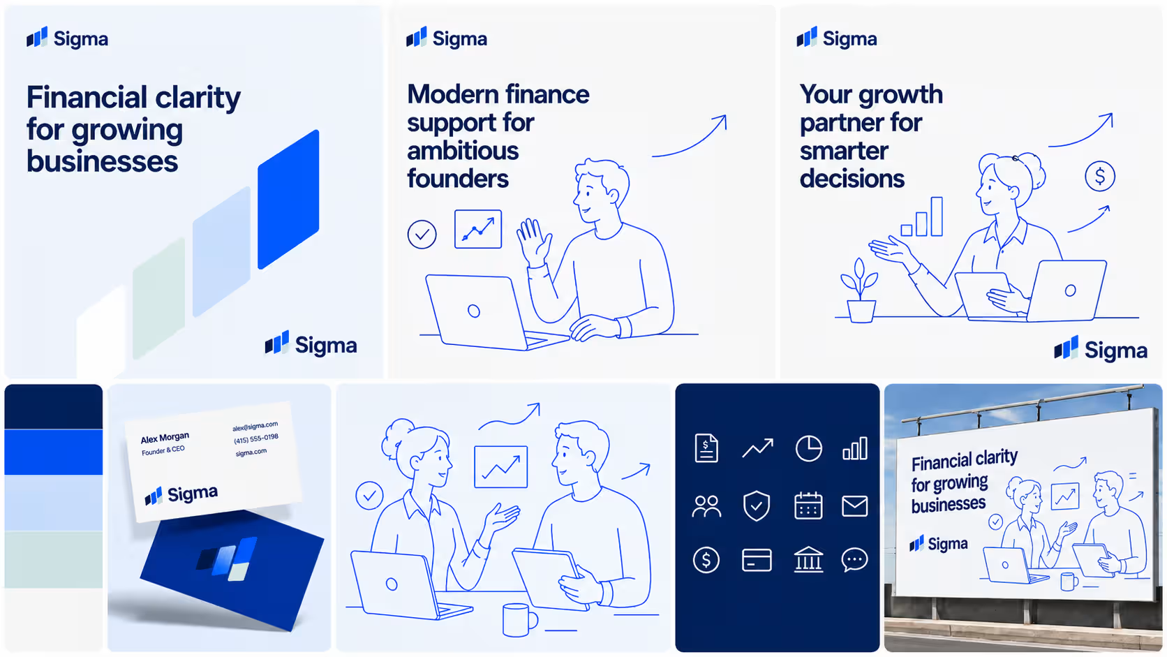
We developed a visual direction around the idea of financial clarity in motion. This became the foundation for the Sigma identity: a system built from simple geometric forms, confident typography, clean data visuals, and warm single-colour illustrations.
The logo mark uses ascending modular shapes to suggest progress, structure, and alignment. Paired with a bold wordmark, the identity feels stable and professional while still carrying a sense of movement.
The wider visual system combines deep navy, signal blue, soft powder blue, and mint accents to create a palette that feels both dependable and fresh. Large typography gives the brand confidence, while the illustration style brings warmth and humanity to a category that can often feel distant or impersonal.
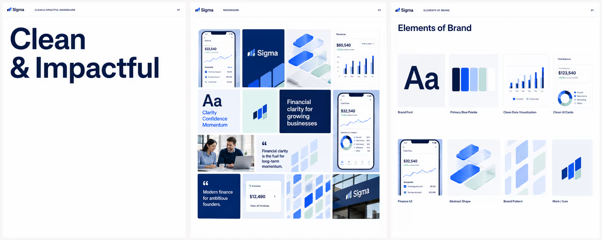
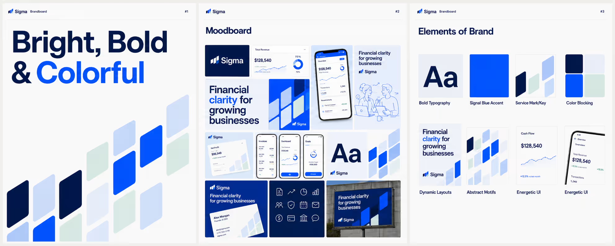
The proposed rebrand positions Sigma as a clear and confident finance partner for modern businesses. It gives the brand a stronger visual presence, a more human tone, and a design system that can grow with the company across product, marketing, and sales.
The result is a finance identity that feels sharp, approachable, and built for momentum.