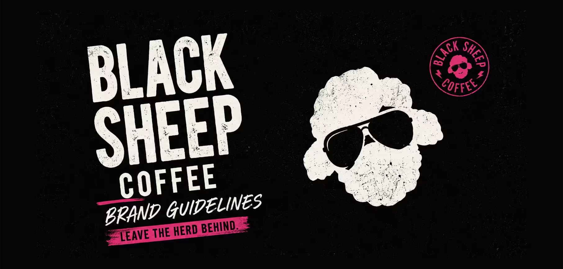
Black Sheep Coffee were in a defining moment in the brand’s journey.
The business had already built serious momentum growing fast, building a loyal community, and carving out a reputation as the challenger brand in a sea of safe, forgettable coffee chains. But the identity no longer reflected the scale, ambition, or cultural energy of where the brand was heading next.
The opportunity wasn’t to reinvent Black Sheep Coffee.
It was to sharpen it. Amplify it. Turn up the volume on everything that already made the brand impossible to ignore.
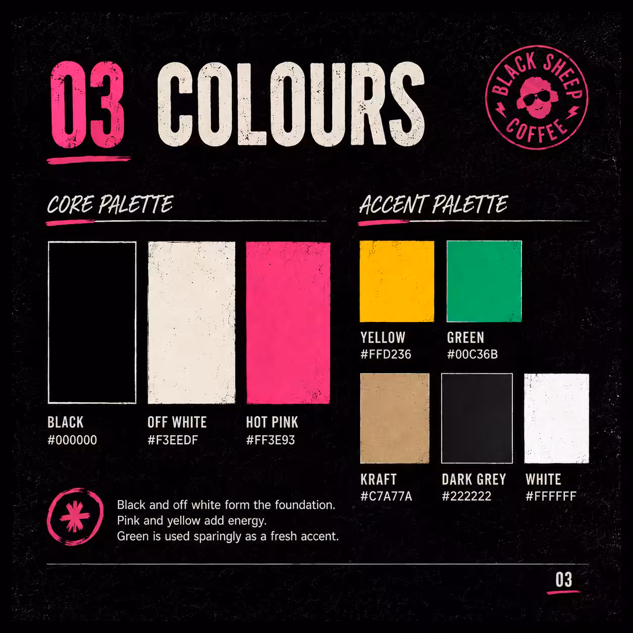
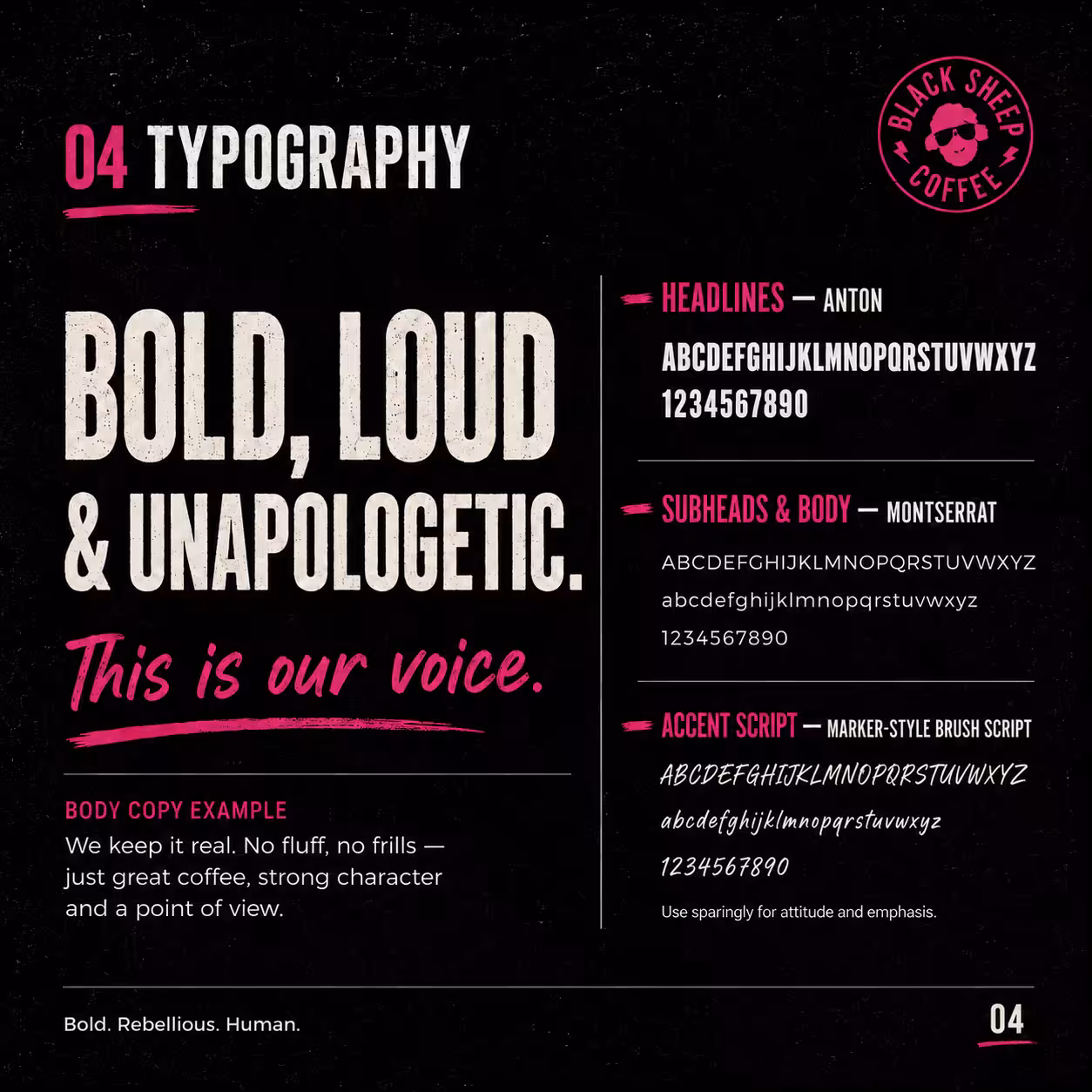
We led a full-scale brand refresh pitch designed to push the identity into a new era of growth. From visual identity and typography to tone of voice, colour systems, textures, campaign styling, social direction and the wider brand world, every touchpoint was rebuilt to feel louder, bolder, sharper and more unapologetically disruptive.
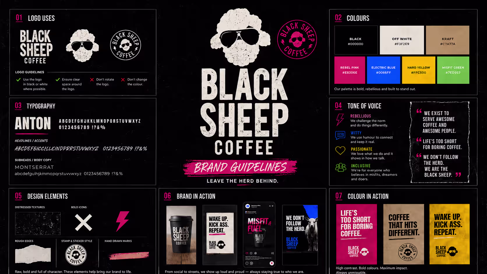
The creative direction leaned heavily into contrast, attitude and cultural edge. Gritty textures. High-impact typography. Fearless messaging. A visual language that felt rebellious, human and impossible to blend in with. Every detail was crafted to reinforce the same message: this brand doesn’t follow the herd, it leads from the front.
.avif)
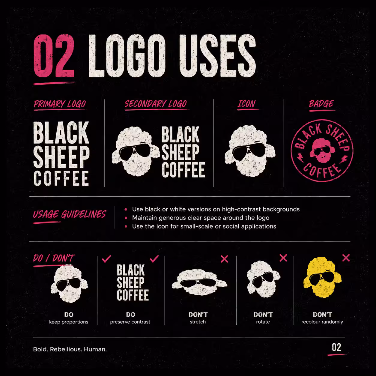
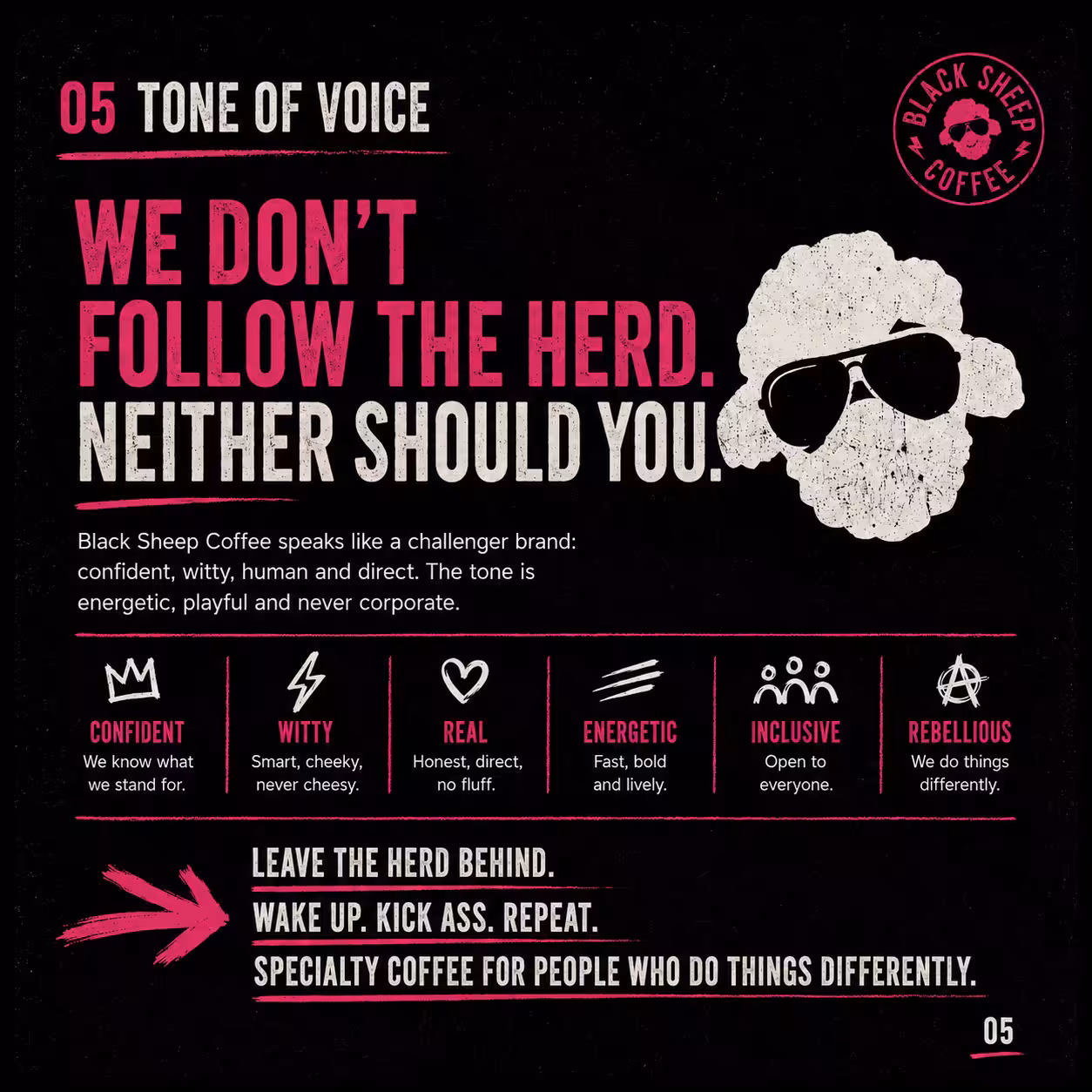
A refreshed identity with a stronger point of view, a more ownable visual world, and a distinctive positioning that cuts through an industry drowning in sameness. The brand now feels as bold as the people behind it and the people drinking it.
Raw. Loud. Unpolished.
Built for outsiders, early risers, rule breakers and people who do things differently.
Black Sheep Coffee.
Leave the herd behind.